Down bad
And some other unrelated items
There’s a popular type of NBA factoid that goes something like, “This team turns into one of the [best/worst] in the league when [player] is [on/off] the court.”
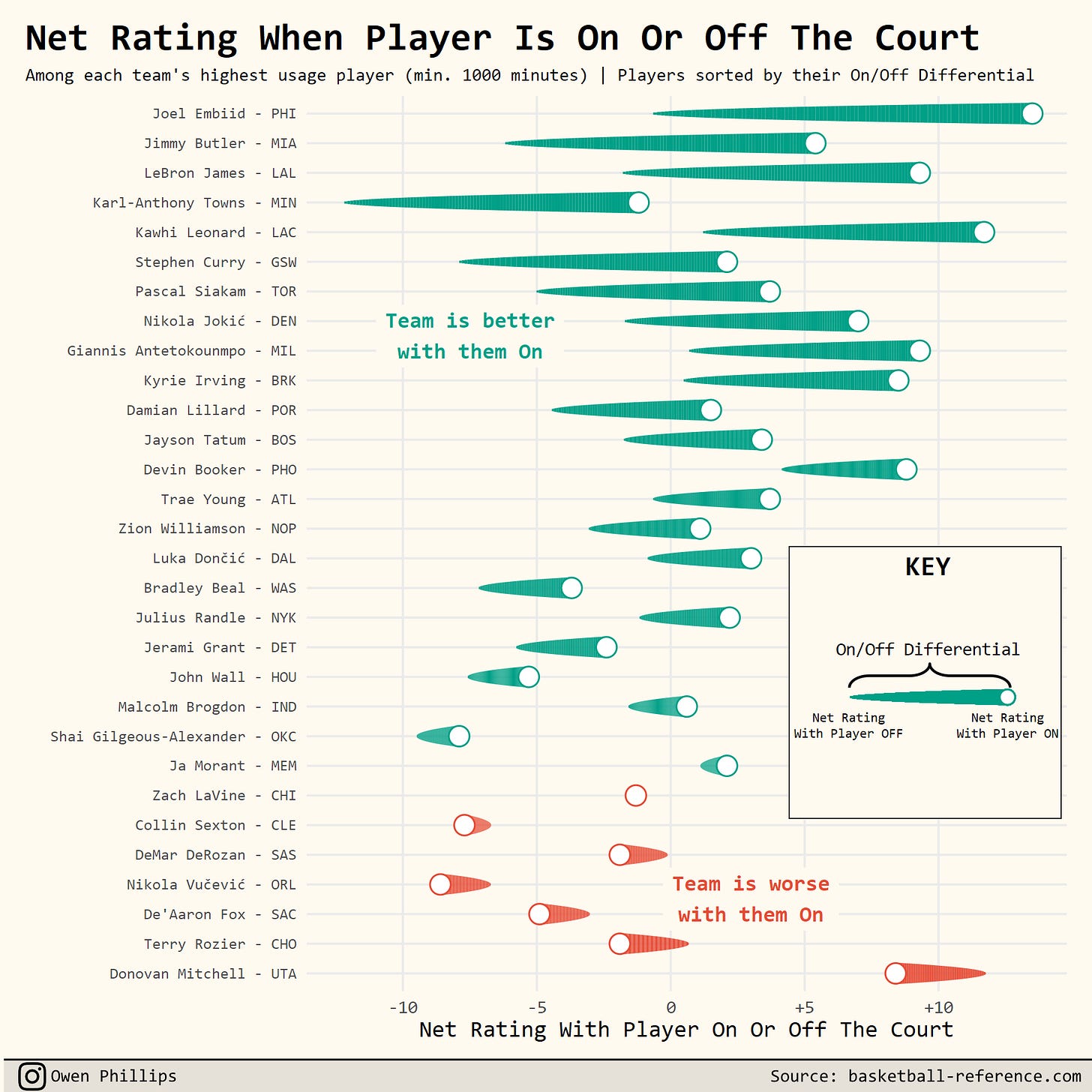
For example, the Golden State Warriors have a net rating of +2.1 when Steph Curry is on the court, but that drops to -8.0 when Steph Curry is off the court. The only teams with a net rating below -8.0 are the Orlando Magic (-8.1) and the Oklahoma City Thunder (-8.4). Therefore, the thinking goes, Curry’s presence is all that’s keeping the Warriors from being a bottom-feeder. While that ultimately probably is true, there are a couple things wrong with using the this line of reasoning.
The first, is that the vast majority of teams are worse off when they’re without their most important player. The chart below shows each team’s highest usage player and the team’s net rating when the corresponding player is either on or off the court. Players are sorted by the difference between the two states. (I’m still showing Nikola Vucevic as Orlando’s highest usage player since half their team got traded at the deadline).
With only a handful of exceptions, most teams are better served by having their primary offensive weapon on the court. So the fact that a team that has been built around a singular star struggles when that star is on the bench isn’t a problem that’s unique to the Warriors.
The degree to which the Warriors are worse off without Curry is somewhat interesting, but that number itself (usually expressed as a player’s point differential or on/off differential) is noisy and context-dependent, which can ultimately lead you to the wrong conclusions. For instance, Curry’s on/off differential (+10.1) pales in comparison to Kent Bazemore’s (+12.6), but you don’t hear anyone suggesting Bazemore is what’s keeping the Warriors afloat.
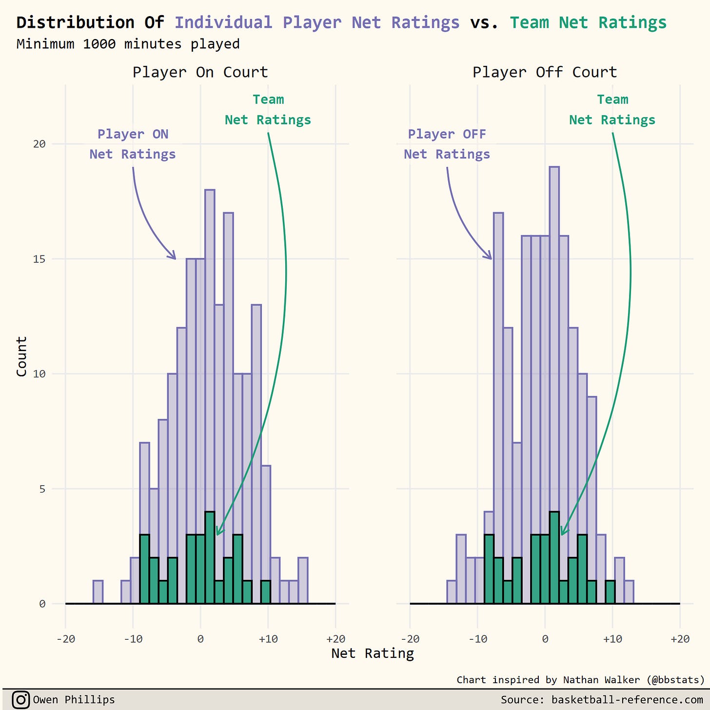
Lastly, teams plays more possessions than players do. That means individual player net ratings will have a higher variance than team net ratings. As a result, the range of net ratings when a player is either on or off the court is much wider than the range of overall team net ratings.
The chart below shows the distribution of individual player net ratings (both when a player is on and off the court) compared to the distribution of team net ratings.
As you can see from the chart, the tails of the distribution for individual net ratings extend well beyond the tails of the distribution of team net ratings. In other words, there are actually quite a few players who meet the criteria of supposedly elevating or submarining their team when they are either on or off the court. No one ever seems to mention this when they make a statement about how great (or terrible) a team is when a certain player is on (or off) the court.
In general, you want to try to avoid making comparisons between a team’s net rating when an individual player is on (or off) the court to a team’s overall net rating (that’s also true with specific lineups, which have even smaller sample sizes). Teams aren’t going to play their best players 48 minutes a game for an entire season so it ends up being an unactionable talking point at best.
Are you not entertained?
I think it was Brian Windhorst who I heard say that the arc of an NBA season mirrors an NBA game in terms of its highs and lows. The first half and the end of the fourth quarter can be very exciting, while everything else is a bit of a drag.
So where we’re at in the NBA season is equivalent to the beginning of the fourth quarter, where many of the starters are on the bench, and everyone’s eyes are glazed over as Denzel Valentine clanks another jumper.
Over on Mike Beuoy’s site, inpredictable.com, we can actually see how much less interesting the games have gotten lately by looking at the Excitement Index for each game played this season.
On inpredictable.com, excitement is defined as “how far the win probability ‘travelled’ over the course of the game.” Games that come down to the wire tend to receive high excitement scores while blowouts are on the lower end of the scale.
Last night’s wire-to-wire match between Boston and Portland registered a 9.4 out of 10 on the Excitement Index. Meanwhile, the stinker between Brooklyn and Minnesota was just a 2.1.
Beuoy graciously shared the data on the Excitement Index of every game so far this season so that I could chart how things have shifted over time. The chart below shows the average day-to-day Excitement of games played, using various rolling windows.
The story is the same across all four charts. Shortly after the All-Star break, things took a turn for the worse.
I don’t think this is cause for concern or anything. This happens every year. But with the introduction of the play-in games this season, the hope is that the decline in the quality of the games won’t be as steep. Giving middling teams an incentive to play their best players all the way through the end of the season should result in an uptick in more exciting games as the regular season continues to wind down.
Elsewhere
Last summer, I published my database of NBA referee fouls and violations. It’s basically just a couple of interactive tables and charts that allow anyone to look at how often a particular referee calls fouls and violations relative to their peers.
It wasn’t groundbreaking by any means. It was just an attempt to fill a hole in the NBA analytics world that I thought could use filling.
(I have very little advice to offer aspiring sports analytics people — I barely know what I’m doing myself— but here’s some: create a public database of something that isn’t currently tracked or easily accessible in its current format. It’s an easy way to get involved in the community and provide something of real value that people will associate with your name.)
I haven’t done much with my referee database since, but the good folks of #MakeoverMonday on Twitter chose to use the data this week to re-create some better looking interactive graphics.
Here are a few that I thought were particularly nice.


