
How To: Hex-Styled Snowflake Charts
F5Days for the people in the back

Hello everyone,
This week I’m doing a free R tutorial for all readers of The F5. If you don’t care about R, I would just ignore or delete this email.
This tutorial will walk through how to make the chart showing the parts of the court where teams tend to take a higher frequency of attempts than a league average team. This is a riff on a previous tutorial I did, but this time we’re going to use hexagons. I’m making this guide free since it relies somewhat heavily on Todd Schneider’s ballr package.
As a reminder, premium subscribers to this newsletter receive R tutorials like this one (usually) every Friday.

Lets begin by loading some packages and setting up a custom theme.
# Load packages
library(tidyverse)
library(nbastatR)
library(extrafont)
library(hexbin)
library(prismatic)
library(teamcolors)
library(cowplot)

# Custom theme
theme_owen <- function () {
  theme_minimal(base_size=11, base_family="Consolas") %+replace%
    theme(
      panel.grid.minor = element_blank(),
      plot.background = element_rect(fill = 'floralwhite', color = "floralwhite")
    )
}
There’s a couple of other things we’ll want to load ahead of time, which include the names of every NBA team as well as their primary team colors.
# Get NBA teams and their names
tms <- nba_teams()
tms <- tms %>%
  filter(isNonNBATeam == 0) %>%
  select(nameTeam, slugTeam)

# Get NBA team colors
tm.colors <- teamcolors
tm.colors <- tm.colors %>%
  filter(league == "nba") %>%
  select(name, primary) %>%
  mutate(primary = case_when(
    name == "Golden State Warriors" ~ "#1D428A",
    name == "Indiana Pacers" ~ "#002D62",
    name == "Los Angeles Lakers" ~ "#552583",
    name == "San Antonio Spurs" ~ "#000000",
    name == "Oklahoma City Thunder" ~ "#EF3B24",
    name == "Charlotte Hornets" ~ "#00788C",
    name == "Utah Jazz" ~ "#00471B",
    name == "New Orleans Pelicans" ~ "#0C2340",
    TRUE ~ primary
  ))
We’re also going to load in the dimensions of an NBA court. I have that up on github and you can just load it directly from there.
# Load NBA court dimensions from github
devtools::source_url("https://github.com/Henryjean/NBA-Court/blob/main/CourtDimensions.R?raw=TRUE")
To make our chart we need the data on every shot attempt from this season season for each team. The easiest way to get this data is through the nbastatR package. The following codes takes a few minutes to run so I recommend saving it at as .CSV after it finishes downloading.
# Get shots
df <- teams_shots(all_active_teams = T, season_types = "Regular Season", seasons = 2021)
Now that we have every shot taken this season we need to make a few tweaks. First, we’re going to create a column that indicates which team is on offense (the team taking the shot) and the team that is on defense (the other team in the game that isn’t taking the shot).
# find out which team is on offense/defense
df <- left_join(df, tms)

# if slugTeam is the home team, then the defense must be the away team (visa versa)
df <- df %>%
  mutate(defense = case_when(
    slugTeam == slugTeamHome ~ slugTeamAway,
    TRUE ~ slugTeamHome
  ))

# get the full name of the defensive team
df <- left_join(df, tms, by = c("defense" = "slugTeam"))

# rename to distinugish between offensive and defensive team
df <- df %>%
  rename("nameTeamOffense" = "nameTeam.x",
         "nameTeamDefense" = "nameTeam.y")
Next, we need to make some tweaks to the location data to fit the dimensions of our court that we’ve already loaded in. We also need to flip the data along the vertical axis.
# transform the location to fit the dimensions of the court, rename variables
df <- df %>%
  mutate(locationX = as.numeric(as.character(locationX)) / 10,
                    locationY = as.numeric(as.character(locationY)) / 10 + hoop_center_y) %>%
  rename("loc_x" = "locationX",
         "loc_y" = "locationY")

# flip values along the y-axis
df$loc_x <- df$loc_x * -1
This will matter later on, but we need to update the LA Clippers team name in the data to help us merge it with a different dataset. Lets go ahead and take care of that now.
# fix the Clippers name
df <- df %>%
  mutate(nameTeamOffense = case_when(
    nameTeamOffense == "LA Clippers" ~ "Los Angeles Clippers",
    TRUE ~ nameTeamOffense
  ))

df <- df %>%
  mutate(slugTeam = case_when(
    nameTeamOffense == "Los Angeles Clippers" ~ "LAC",
    TRUE ~ slugTeam
  ))
For our chart, we’re just going to look at shots taken within 35 feet. Lets filter our data like so.
# Filter out backcourt shots or anything more than 35 feet
df <- df %>%
  filter(zoneBasic != "Backcourt" & distanceShot <= 35)
Next, we’re going to run some code that helps create our hexagons and map them on to our existing shot data. Feel free to fiddle with the size of the binwidths of the hexes. I’ve found 3.5 works okay for this type of chart, but adjust as you see fit.
# Create a function that helps create our custom hexs
hex_bounds <- function(x, binwidth) {
  c(
    plyr::round_any(min(x), binwidth, floor) - 1e-6,
    plyr::round_any(max(x), binwidth, ceiling) + 1e-6
  )
}

# Set the size of the hex
binwidths <- 3.5

# Calculate the area of the court that we're going to divide into hexagons
xbnds <- hex_bounds(df$loc_x, binwidths)
xbins <- diff(xbnds) / binwidths
ybnds <- hex_bounds(df$loc_y, binwidths)
ybins <- diff(ybnds) / binwidths

# Create a hexbin based on the dimensions of our court
hb <- hexbin(
  x = df$loc_x,
  y = df$loc_y,
  xbins = xbins,
  xbnds = xbnds,
  ybnds = ybnds,
  shape = ybins / xbins,
  IDs = TRUE
)

# map our hexbins onto our dataframe of shot attempts
df <- mutate(df, hexbin_id = hb@cID)
Before we can know how much more often a team takes shots from a particular spot relative to league average, we need to know what the league average amount of attempts from each spot is. Let’s calculate that by looking at the total number of attempts from each hexagon and then finding the number of shots that come from that spot as a percentage of all shots.
# find the leauge avg % of shots coming from each hex
la <- df %>%
  group_by(hexbin_id) %>%
  summarize(hex_attempts = n()) %>%
  ungroup() %>%
  mutate(hex_pct = hex_attempts / sum(hex_attempts, na.rm = TRUE)) %>%
  ungroup() %>%
  rename("league_average" = "hex_pct") %>%
  select(-hex_attempts)
Okay, now we need to find out what percent of shots come from each spot for EACH team.
# Calculate the % of shots coming from each hex for each team
hexbin_stats <- df %>%
  group_by(hexbin_id, nameTeamOffense) %>%
  summarize(hex_attempts = n()) %>%
  ungroup() %>%
  group_by(nameTeamOffense) %>%
  mutate(hex_pct = hex_attempts / sum(hex_attempts, na.rm = TRUE)) %>%
  ungroup()
Now we can merge that data with our league average data to calculate how far away from the mean each team’s percentage of shots coming from a particular spot is.
hexbin_stats <- hexbin_stats %>%
  left_join(., la) %>%
  group_by(hexbin_id) %>%
  mutate(sd_hex_pct = sd(hex_pct, na.rm = TRUE),
         z_score = (hex_pct - league_average) / sd_hex_pct)
Alright, full disclosure: I kind of only barely know what the next bit of code does. This is where I really rely on Todd Schneider’s ballr package. You can read more about what each function does on the hexbin package, or you can just run the code and be ignorant like me. Your choice!
# Full disclosure, no idea what this next part does
# from hexbin package, see: https://github.com/edzer/hexbin
sx <- hb@xbins / diff(hb@xbnds)
sy <- (hb@xbins * hb@shape) / diff(hb@ybnds)
dx <- 1 / (2 * sx)
dy <- 1 / (2 * sqrt(3) * sy)
origin_coords <- hexcoords(dx, dy)

hex_centers <- hcell2xy(hb)

hexbin_coords <- bind_rows(lapply(1:hb@ncells, function(i) {
  data.frame(
    x = origin_coords$x + hex_centers$x[i],
    y = origin_coords$y + hex_centers$y[i],
    center_x = hex_centers$x[i],
    center_y = hex_centers$y[i],
    hexbin_id = hb@cell[i]
  )
}))

# Merge out hexbin coordinates with our hexbin stats
hex_data <- inner_join(hexbin_coords, hexbin_stats, by = "hexbin_id")

# Adjusts the size of the hexagons
hex_data <- hex_data %>%
  mutate( radius_factor = .99,
          adj_x = center_x + radius_factor * (x - center_x),
          adj_y = center_y + radius_factor * (y - center_y))
So here’s what our data should look like:
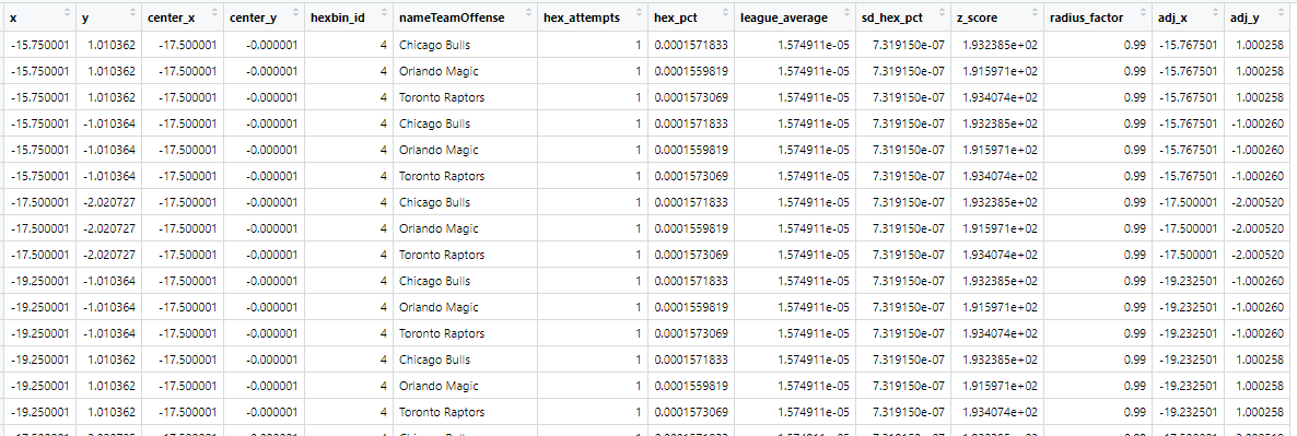
We’ve got hexbin_ids for each team which shows the number of attempts that a team took from that spot as well as the league average frequency from that spot and the difference between the two.
To make our chart, we need to merge this data with our team colors dataset. But we also want the abbreviated name for each team as well, so we’re also going to merge this data with out team dataset we loaded in the beginning (this is where it also helps that we adjusted the Clippers team name earlier).
# merge with the tms data so that we can have the abbreviated name
hex_data <- left_join(hex_data, tms, by = c('nameTeamOffense' = 'nameTeam'))

# merge with the team colors
hex_data <- left_join(hex_data, tm.colors, by = c("nameTeamOffense" = "name"))
In our chart we want to remove some of the noise so lets limit our dataset just to those spots on the court where a team has a taken at least 10 attempts and has a z-score greater than 0, which just means the team takes shots from that spot at a higher frequency than a league average team. If you really want to emphasize the spots that are unique to each team, set the z-score filter a little higher (0.3 works well).
# minimum of 10 attempts and have a z-score >= 0
hex_data <- hex_data %>% filter(hex_attempts >= 10 & hex_data$z_score > 0 & !is.na(slugTeam))
Congratulations, we made it. We can finally plot our chart.
This first bit of code makes an ugly and distorted plot, but it helps to talk about things if I take it step by step.
ggplot() +
  geom_polygon(data = hex_data,
               aes(x = adj_x, y = adj_y, alpha = sqrt(z_score), fill = primary, color = after_scale(clr_darken(fill, 0.3)), group = hexbin_id),
               size = .25) +
  theme_owen() +
  facet_wrap(~slugTeam, nrow = 5, strip.position = 'top') +
  scale_alpha_continuous(range = c(.05, 1)) +
scale_fill_identity() 
We’re plotting the the hexagons for each team where they take a higher frequency of attempts from that spot than a league average team. The degree to which they take more than a league average team will be represented by the alpha parameter. The color of each hexagon will be determined by their primary color from the teamcolors package. We’re also going to use the prismatic package to make those colors “pop” a little more.
Everything else is mostly just a matter of making theme tweaks. We’re also going to adjust the dimensions of the plot and add a title and caption.
ggplot() +
  geom_polygon(data = hex_data,
               aes(x = adj_x, y = adj_y, alpha = sqrt(z_score), fill = primary, color = after_scale(clr_darken(fill, 0.3)), group = hexbin_id),
               size = .25) +
  theme_owen() +
  facet_wrap(~slugTeam, nrow = 5, strip.position = 'top') +
  scale_alpha_continuous(range = c(.05, 1)) +
  scale_fill_identity() +
  theme(legend.position = 'none',
        line = element_blank(),
        axis.title.x = element_blank(),
        axis.title.y = element_blank(),
        axis.text.x = element_blank(),
        axis.text.y = element_blank(),
        panel.spacing  = unit(-.25, "lines"),
        plot.title = element_text(face = 'bold', hjust= .5, size = 15, color = 'black',  family = "Consolas"),
        plot.caption  = element_text(size = 6, hjust= .5, color = 'black', family = "Consolas"),
        strip.text = element_text(size = 8, vjust = -1, face = 'bold', family = "Consolas")) +
  scale_y_continuous(limits = c(-2.5, 42)) +
  scale_x_continuous(limits = c(-30, 30))  +
  coord_fixed(clip = 'off') +
  labs(title =  "Where Teams Like To Shoot From\nRelative To League Average",
caption = "Darker and denser areas indicate a team takes more shots from that spot relative to the league as a whole") 
Lastly, we just need to draw the court itself and add a floral white background to everything.
p <- ggplot() +
  geom_polygon(data = hex_data,
               aes(x = adj_x, y = adj_y, alpha = sqrt(z_score), fill = primary, color = after_scale(clr_darken(fill, 0.3)), group = hexbin_id),
               size = .25) +
  theme_owen() +
  facet_wrap(~slugTeam, nrow = 5, strip.position = 'top') +
  scale_alpha_continuous(range = c(.05, 1)) +
  scale_fill_identity() +
  theme(legend.position = 'none',
        line = element_blank(),
        axis.title.x = element_blank(),
        axis.title.y = element_blank(),
        axis.text.x = element_blank(),
        axis.text.y = element_blank(),
        panel.spacing  = unit(-.25, "lines"),
        plot.title = element_text(face = 'bold', hjust= .5, size = 15, color = 'black',  family = "Consolas"),
        plot.caption  = element_text(size = 6, hjust= .5, color = 'black', family = "Consolas"),
        strip.text = element_text(size = 8, vjust = -1, face = 'bold', family = "Consolas")) +
  scale_y_continuous(limits = c(-2.5, 42)) +
  scale_x_continuous(limits = c(-30, 30))  +
  coord_fixed(clip = 'off') +
  labs(title =  "Where Teams Like To Shoot From\nRelative To League Average",
       caption = "Darker and denser areas indicate a team takes more shots from that spot relative to the league as a whole")  +
  geom_path(data = court_points,
            aes(x = x, y = y, group = desc, linetype = dash),
            color = "black", size = .25)

p <- ggdraw(p) +
  theme(plot.background = element_rect(fill="floralwhite", color = NA))

ggsave("HexChart.png", p, width = 6, height = 6, dpi = 300, type = 'cairo')
Full code
# Load packages
library(tidyverse)
library(nbastatR)
library(extrafont)
library(hexbin)
library(prismatic)
library(teamcolors)
library(cowplot)

# Custom theme
theme_owen <- function () {
  theme_minimal(base_size=11, base_family="Consolas") %+replace%
    theme(
      panel.grid.minor = element_blank(),
      plot.background = element_rect(fill = 'floralwhite', color = "floralwhite")
    )
}

# Get NBA teams and their names
tms <- nba_teams()
tms <- tms %>%
  filter(isNonNBATeam == 0) %>%
  select(nameTeam, slugTeam)

# Get NBA team colors
tm.colors <- teamcolors
tm.colors <- tm.colors %>%
  filter(league == "nba") %>%
  select(name, primary) %>%
  mutate(primary = case_when(
    name == "Golden State Warriors" ~ "#1D428A",
    name == "Indiana Pacers" ~ "#002D62",
    name == "Los Angeles Lakers" ~ "#552583",
    name == "San Antonio Spurs" ~ "#000000",
    name == "Oklahoma City Thunder" ~ "#EF3B24",
    name == "Charlotte Hornets" ~ "#00788C",
    name == "Utah Jazz" ~ "#00471B",
    name == "New Orleans Pelicans" ~ "#0C2340",
    TRUE ~ primary
  ))

# Load NBA court dimensions from github
devtools::source_url("https://github.com/Henryjean/NBA-Court/blob/main/CourtDimensions.R?raw=TRUE")

# Get shots
df <- teams_shots(all_active_teams = T, season_types = "Regular Season", seasons = 2021)

# join w/ team dataset so that we can find out which team is on offense/defense
df <- left_join(df, tms)

# if slugTeam is the home team, then the defense must be the away team (visa versa)
df <- df %>%
  mutate(defense = case_when(
    slugTeam == slugTeamHome ~ slugTeamAway,
    TRUE ~ slugTeamHome
  ))

# get the full name of the defensive team
df <- left_join(df, tms, by = c("defense" = "slugTeam"))

# rename to distinugish between offensive and defensive team
df <- df %>%
  rename("nameTeamOffense" = "nameTeam.x",
         "nameTeamDefense" = "nameTeam.y")

# transform the location to fit the dimensions of the court, rename variables
df <- df %>%
  mutate(locationX = as.numeric(as.character(locationX)) / 10,
                    locationY = as.numeric(as.character(locationY)) / 10 + hoop_center_y) %>%
  rename("loc_x" = "locationX",
         "loc_y" = "locationY")

# flip values along the y-axis
df$loc_x <- df$loc_x * -1

# fix the Clippers name
df <- df %>%
  mutate(nameTeamOffense = case_when(
    nameTeamOffense == "LA Clippers" ~ "Los Angeles Clippers",
    TRUE ~ nameTeamOffense
  ))

df <- df %>%
  mutate(slugTeam = case_when(
    nameTeamOffense == "Los Angeles Clippers" ~ "LAC",
    TRUE ~ slugTeam
  ))

# Filter out backcourt shots or anything more than 35 feet
df <- df %>%
  filter(zoneBasic != "Backcourt" & distanceShot <= 35)

# Create a function that helps create our custom hexs
hex_bounds <- function(x, binwidth) {
  c(
    plyr::round_any(min(x), binwidth, floor) - 1e-6,
    plyr::round_any(max(x), binwidth, ceiling) + 1e-6
  )
}

# Set the size of the hex
binwidths <- 3.5

# Calculate the area of the court that we're going to divide into hexagons
xbnds <- hex_bounds(df$loc_x, binwidths)
xbins <- diff(xbnds) / binwidths
ybnds <- hex_bounds(df$loc_y, binwidths)
ybins <- diff(ybnds) / binwidths

# Create a hexbin based on the dimensions of our court
hb <- hexbin(
  x = df$loc_x,
  y = df$loc_y,
  xbins = xbins,
  xbnds = xbnds,
  ybnds = ybnds,
  shape = ybins / xbins,
  IDs = TRUE
)

# map our hexbins onto our dataframe of shot attempts
df <- mutate(df, hexbin_id = hb@cID)

# find the leauge avg % of shots coming from each hex
la <- df %>%
  group_by(hexbin_id) %>%
  summarize(hex_attempts = n()) %>%
  ungroup() %>%
  mutate(hex_pct = hex_attempts / sum(hex_attempts, na.rm = TRUE)) %>%
  ungroup() %>%
  rename("league_average" = "hex_pct") %>%
  select(-hex_attempts)

# Calculate the % of shots coming from each hex for each team
hexbin_stats <- df %>%
  group_by(hexbin_id, nameTeamOffense) %>%
  summarize(hex_attempts = n()) %>%
  ungroup() %>%
  group_by(nameTeamOffense) %>%
  mutate(hex_pct = hex_attempts / sum(hex_attempts, na.rm = TRUE)) %>%
  ungroup()

# Find the diff b/w each team freq. and league average
hexbin_stats <- hexbin_stats %>%
  left_join(., la) %>%
  group_by(hexbin_id) %>%
  mutate(sd_hex_pct = sd(hex_pct, na.rm = TRUE),
         z_score = (hex_pct - league_average) / sd_hex_pct)

# Full disclosure, no idea what this next part does
# from hexbin package, see: https://github.com/edzer/hexbin
sx <- hb@xbins / diff(hb@xbnds)
sy <- (hb@xbins * hb@shape) / diff(hb@ybnds)
dx <- 1 / (2 * sx)
dy <- 1 / (2 * sqrt(3) * sy)
origin_coords <- hexcoords(dx, dy)

hex_centers <- hcell2xy(hb)

hexbin_coords <- bind_rows(lapply(1:hb@ncells, function(i) {
  data.frame(
    x = origin_coords$x + hex_centers$x[i],
    y = origin_coords$y + hex_centers$y[i],
    center_x = hex_centers$x[i],
    center_y = hex_centers$y[i],
    hexbin_id = hb@cell[i]
  )
}))

# Merge out hexbin coordinates with our hexbin stats
hex_data <- inner_join(hexbin_coords, hexbin_stats, by = "hexbin_id")

# Adjusts the size of the hexagons
hex_data <- hex_data %>%
  mutate( radius_factor = .99,
          adj_x = center_x + radius_factor * (x - center_x),
          adj_y = center_y + radius_factor * (y - center_y))

# merge with the tms data so that we can have the abbreviated name
hex_data <- left_join(hex_data, tms, by = c('nameTeamOffense' = 'nameTeam'))

# merge with the team colors
hex_data <- left_join(hex_data, tm.colors, by = c("nameTeamOffense" = "name"))

# only look at hexes that have a minmum of 10 attempts and have a z_score >= 0
hex_data <- hex_data %>% filter(hex_attempts >= 10 & hex_data$z_score > 0 & !is.na(slugTeam))

p <- ggplot() +
  geom_polygon(data = hex_data,
               aes(x = adj_x, y = adj_y, alpha = sqrt(z_score), fill = primary, color = after_scale(clr_darken(fill, 0.3)), group = hexbin_id),
               size = .25) +
  theme_owen() +
  facet_wrap(~slugTeam, nrow = 5, strip.position = 'top') +
  scale_alpha_continuous(range = c(.05, 1)) +
  scale_fill_identity() +
  theme(legend.position = 'none',
        line = element_blank(),
        axis.title.x = element_blank(),
        axis.title.y = element_blank(),
        axis.text.x = element_blank(),
        axis.text.y = element_blank(),
        panel.spacing  = unit(-.25, "lines"),
        plot.title = element_text(face = 'bold', hjust= .5, size = 15, color = 'black',  family = "Consolas"),
        plot.caption  = element_text(size = 6, hjust= .5, color = 'black', family = "Consolas"),
        strip.text = element_text(size = 8, vjust = -1, face = 'bold', family = "Consolas")) +
  scale_y_continuous(limits = c(-2.5, 42)) +
  scale_x_continuous(limits = c(-30, 30))  +
  coord_fixed(clip = 'off') +
  labs(title =  "Where Teams Like To Shoot From\nRelative To League Average",
       caption = "Darker and denser areas indicate a team takes more shots from that spot relative to the league as a whole")  +
  geom_path(data = court_points,
            aes(x = x, y = y, group = desc, linetype = dash),
            color = "black", size = .25)

p <- ggdraw(p) +
  theme(plot.background = element_rect(fill="floralwhite", color = NA))

ggsave("HexChart.png", p, width = 6, height = 6, dpi = 300, type = 'cairo')