

Welcome to a Sunday edition of The F5.
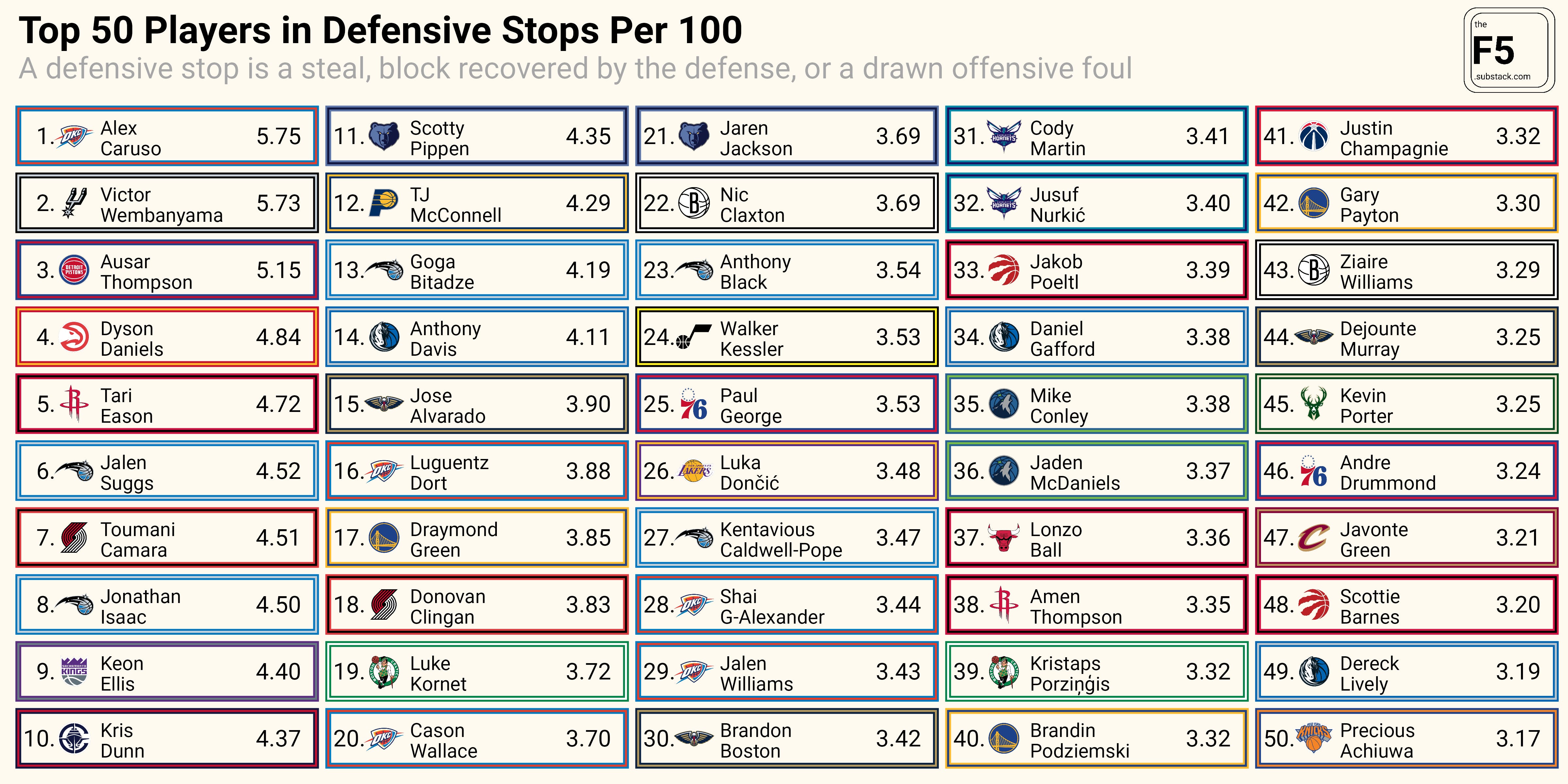
In today’s post I’m going to show you how I made the following chart, which shows the top 50 players in defensive stops per 100 possessions. For more tutorials on how to work with NBA data, check out The F5 archive.
But first, a Sunday Statoid.
I recently was looking for jump ball stats, but couldn’t find them posted anywhere. So I jumped into the NBA’s play-by-play data to see which players have been involved in the most jump balls this season and who’s been most successful.

I’ll be honest, I did not expect to see Jusuf Nurkic at number 1.
Nurk has won more than 80 percent of his jump balls this season, up from his career average of 65 percent.
Meanwhile, Nikola Vucevic ranks 30th, having won just 13 percent of his jump balls this season. His only wins have come against:
Ben Simmons
Collin Sexton
Jeremy Sochan
Karl-Anthony Towns
Yves Missi
Mo Bama
Guerschon Yabusele
Jalen Duren
Not exactly a murders’ row.
For more jump ball related minutia, I recommend Saurabh Rane’s web app that uses an ELO rating system to rank NBA players by their jump ball wins and losses.
How to Create Leaderboards with ggplot2
I think the cool thing about this chart is that despite kinda looking like a table, it’s all made with the ggplot2.
Let’s jump in.
Start by loading some packages and defining a custom theme for our plot.