How To Make Great Tables In Python
🐍 Summer
Howdy folks,
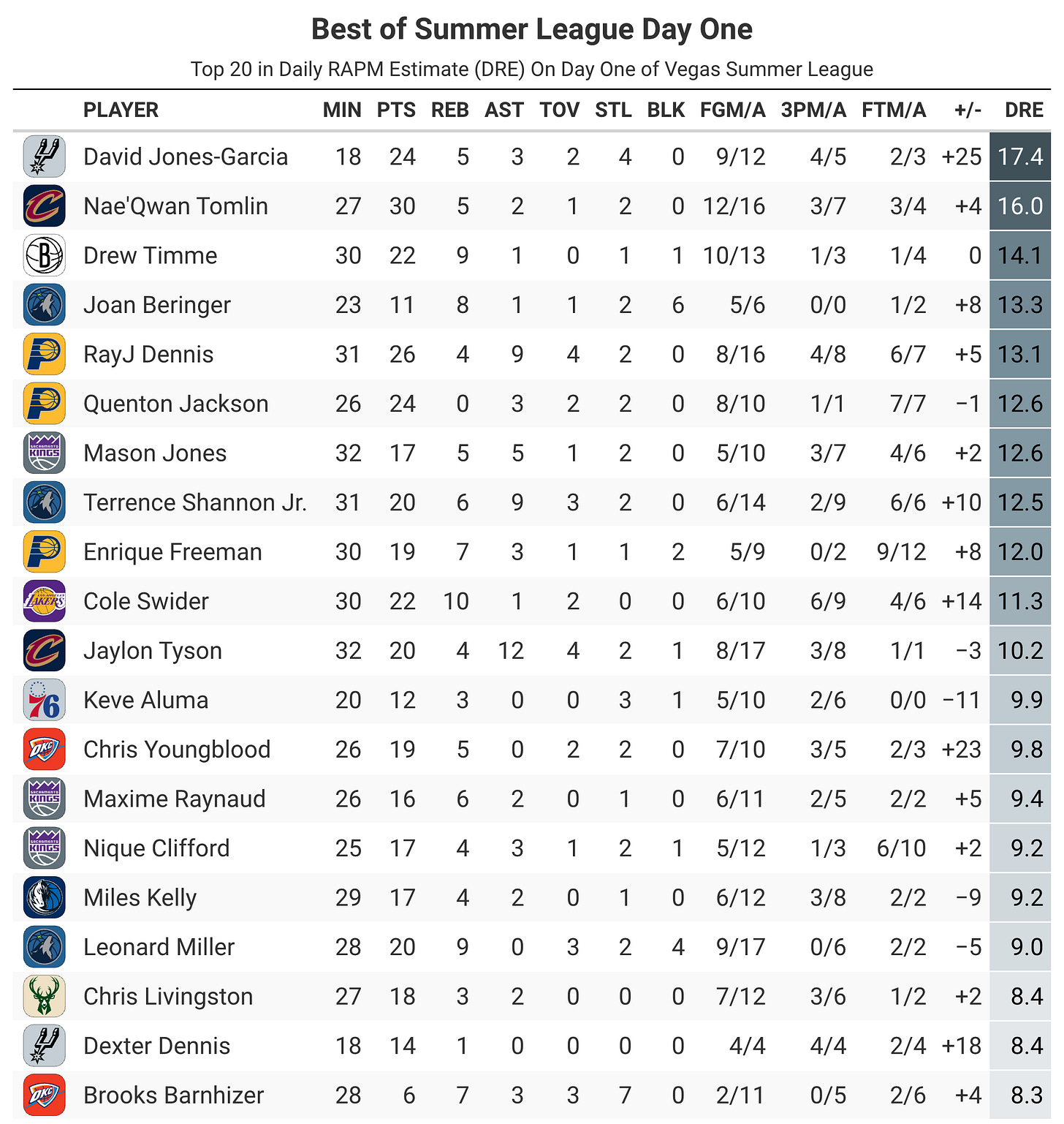
In today’s tutorial I’m going to show you how I made the following table in both Python and R.
The graphic above shows the top performers (by Daily RAPM Estimate) from the first day of Vegas Summer League. To make this chart, I used the great-tables package in Python, which recently got even better thanks to the newly released gt-extras package. These packages are essentially a port of {gt} and {gtExtras} from R, which allow users to quickly make tables that look good.
I’ll walk you through the steps I took in Python to get the data and make the table. Then, at the end, I’ll paste the code for how to do the same thing in R.
Let’s jump in.
How To Make Great Tables In Python
Jump to Python code or R code without commentary.
We’ll start by importing (or installing) the necessary packages.


