


It's All About How You Start
Plus a Q&A with Todd Whitehead, my favorite chartist

A lot of attention is given to how a possession ends — a make, a miss, a foul. So much so that how the possession began is often an afterthought. As it turns out though, how a possession starts can tell us a lot about how it might end.
For instance, an uncontested layup on one end often starts because of a liveball turnover on the other end. As they say, the best offense is a good defense.
But we can drill down deeper than that.
An offensive possession that starts with a defensive rebound usually has better outcomes than a possession that starts after a made basket. Offenses can manufacture semi-transition plays by grabbing a rebound and pushing the ball up the court while the defense is backpedaling to get set. That’s harder to do when you have to take the ball out of your own net first.
Even deeper…
Starting with a defensive rebound off a missed two is better than starting with a defensive rebound off a missed three. Most threes are taken from above the break so at least one player is already close to midcourt when the possession changes hands. It’s tough to beat the defense down the court when someone’s already standing there.
And deeper….
A team that blows a layup on one end is almost guaranteed to give up an open shot on the other end. That’s because missed shots from up close are often accompanied by someone falling down, someone complaining to the ref, or both. Either way, they’re getting left behind the play and leaving their team to defend four-on-five.
The chart below gives an overview of how offensive efficiency varies depending on how the possession starts. All values are relative to the overall league average offensive efficiency. So for example, starting a possession by forcing a live ball turnover juices your Offensive Rating by about 17 points per 100.
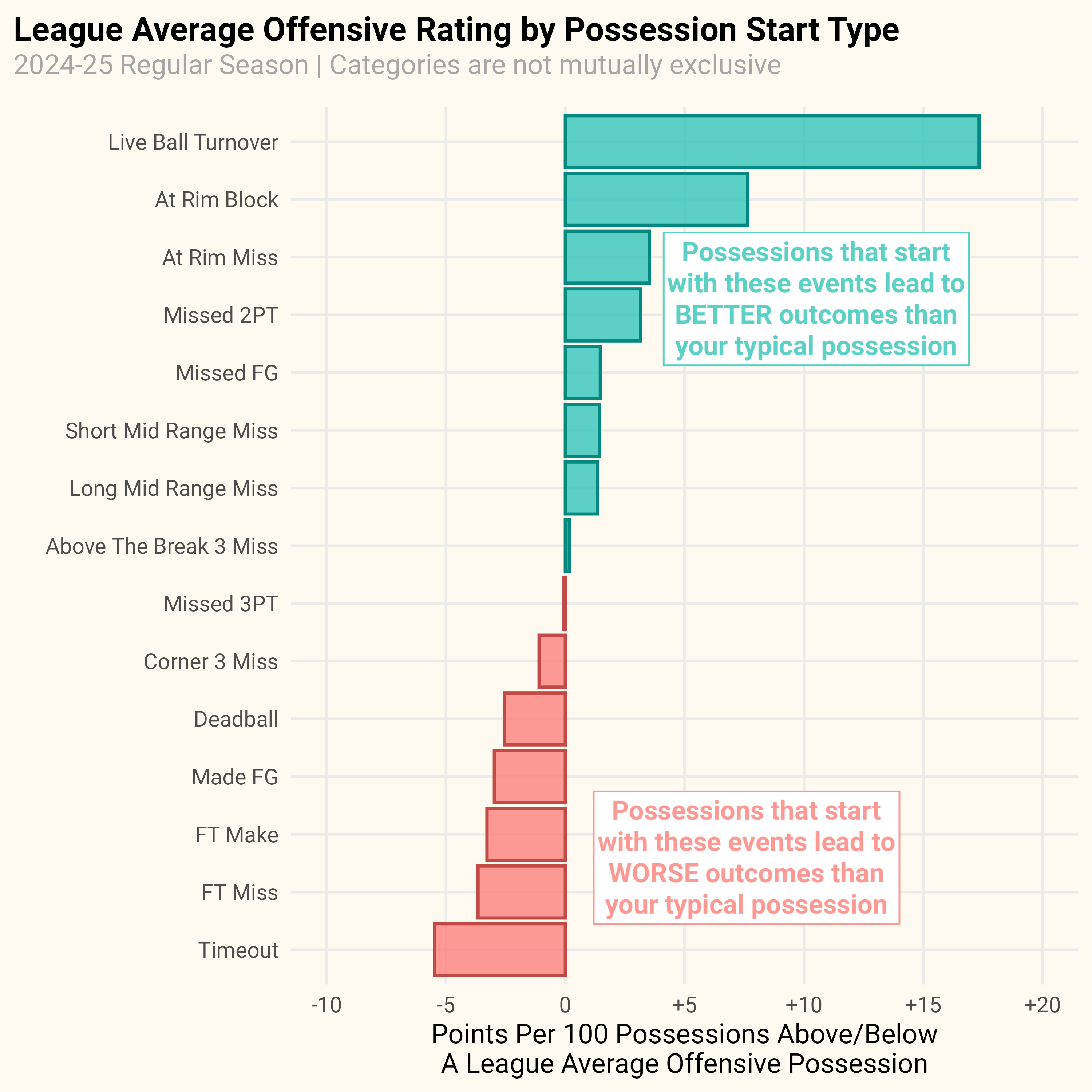
The big takeaway for me though is that a missed shot at the rim is the best way you can start a possession outside of forcing a liveball turnover. This is one of those things in the NBA that once you become conscious of it you’ll start to notice every time you watch a game.
Here’s an example from a recent game between the Mavericks and Warriors.
Olivier-Maxence Prosper drives into Kevon Looney for a shot at the rim, but he misses and falls down because he’s Olivier-Maxence Prosper. Five seconds later Brandin Podziemski is shooting a layup on the other end because Dallas was tasked with defending four-on-five.
To be fair to Prosper and the Mavericks, the Warriors are the league’s best team at converting missed shots at the rim into easy points on the other end. They average 133 points per 100 when they start a possession with a defensive rebound off a missed shot at the rim. That’s 10 points per 100 higher than the Cleveland Cavaliers’ number one ranked offense.

Unfortunately, the Warriors can’t build their entire offense around rebounds off missed shots at the rim. If they could they would rank a lot higher than 16th in Offensive Rating.
But I do wonder if some teams could benefit from baiting their opponents into taking ill advised shots at the rim. If executed correctly, it could lead to more juiced up offensive possessions where you’re getting to play five-on-four.
For example, the Dallas Mavericks are 20th in shots allowed at the rim (meaning, they allow the 10th most shots at the rim), but they’re 2nd in opponent field goal percentage at the rim. So the Mavericks allow more shots at the rim than most teams, but they’re also better at defending those shots than just about anybody else. As a result, they accumulate possessions that start with a defensive rebound off a missed shot at the rim. That’s not the entire reason why the Mavericks have a top ten offense despite trading away the league’s 2nd best offensive player, but I think it helps.
To be clear, I’m not suggesting teams roll out the red carpet to the basket. But I do think there’s room for some teams to be less dogmatic about limiting shots at the rim at all costs. If a team has the defensive personnel to make shots at the rim sufficiently difficult then I think they can start to tilt the numbers in their advantage after accounting for the offensive boost from starting a possession in an advantageous position.
A Refreshing Q&A with Todd Whitehead, @CrumpledJumper
There is a good chance that The F5 would not exist without Todd Whitehead — better known as CrumpledJumper on twitter. When I first started sharing my work online Todd was among the first people to signal boost it. I think I had double digit followers at that point and getting his stamp of approval meant a lot and motivated me to keep posting.
Besides being a consummate good guy, Todd is also the best basketball chart marker alive. You know you’ve made it as a Chart Guy when ArtButMakeItSports starts riffing on your stuff.

In his day job Todd works in analytics and insights for Sportradar. Luckily for all of us, Todd’s job allows him to share his insights through charts and graphs on social media. No one blends creativity and clarity quite like Todd.
I reached out to Todd to talk about writing an unsolicited newsletter, Nathan Yau, and his love for Microsoft Office.
This Q&A has been lightly edited for length and clarity
F5: Did you have any creative hobbies growing up? Or was data visualization your first foray into making art?
TW: My favorite hobby as a kid was simulating sporting events. Obviously basketball was a frequent distraction in this virtual arena. Little known fact: “crumpled paper jumper” (later shortened to “crumpledjumper”) was the inspiration for my handle not my poor jump shot (although it works on multiple levels, sadly). Whether it was into a waste basket, a milk crate, a laundry hamper, whatever – I was always imagining myself as Lawrence Moten or Adrian Autry. But not just like trying a buzzer beater and then getting on with the rest of my day. These were full-game simulations. Full sets of Michael Chang (me) vs. Andre Agassi (also me but half-heartedly) at the U.S. Open were played out against the back of the barn. Full turns through the Mets lineup, at-bats for everybody right down to Kevin Elster were tossed into the air and smacked past invisible (error-prone) opponents. I imagined football games. American Gladiators. The Olympics (which were great because you could host multiple sports in one day!).
And I lived in a small town so you could (if your threshold for embarrassment was sufficiently high), participate in any creative hobby you desired. So, yea, I was in the band (tuba!), I sang in the show choir, I was the incorrigible Kurt in a production of The Sound of Music. And I tried my hand at painting and making things with clay, too, although I never had any special aptitude for that (not as good as my sister, certainly). I did like to doodle and I would draw and re-draw the same simple sports scenes over and over again. I have one flip book of Shaq breaking a backboard that survived in a box in my parents attic that I was especially proud of. That one was a real precursor of what was to come!
What was your first big Aha moment with data visualization? Was there a specific chart or practitioner that made you go, “Yeah, I want to do that.” I know for me it was a Nathan Yau joint but curious if there was something specific for you.
TW: I used to love reading FiveThirtyEight at lunch. The stuff they were making ten years ago was a big inspiration to me. The Complete History of the NBA interactive that Reuben Fischer-Baum made with their ELO metric and the accompanying post that Nate Silver wrote about trying to quantify which NBA dynasty was the best ever is one that sticks out in my memory. That approach of putting a numbers-based spin on a classic, impossible-to-win basketball argument was an idea that appealed to me. And I really appreciated the visual style of their tables and charts: that Venn diagram of Warriors on-off stats, the wild flow chart showing the chances of winning a penalty shootout with a bunch of chaotic red and blue boxes connected by crisscrossing arrows, the plot showing the convergence of the 5- and 12-seeds in the NCAA tournament. That stuff lit my brain on fire. I wanted to make my own stuff like that.
And you mentioned Nathan Yau. I started out in public health and his book, Visualize This, begins with a reference to a classic piece of data viz that I first saw in one of my epi classes. It’s part of a tool called Trendalyzer that was created by Hans Rosling, a professor of international health and the director of the Gapminder Foundation. The project shows a scatterplot of life expectancy vs. income per person and it highlights how poverty has changed over time at very different rates in different global regions. Yau was pointing out the power of a really compelling chart and that’s certainly an example of an impactful chart that’s stuck with me as well. There were lots of other good, inspiring data viz in grad school – heat maps, “Manhattan” plots, pollution plumes – stretching all the way back to the OG, John Snow (who made the famous Broad Street Pump map of the London cholera outbreak in 1854), which also contributed to a vague desire of mine to do something with a visual bent.
But a true “Aha” moment? I think the closest I’ve had was reading Tufte’s Visual Display of Quantitative Information. I had already started to dip my toe into data viz, fumbling around with some early attempts to make charts with basketball data when somebody suggested I might be interested to read (or I might benefit from reading – ha – I can’t remember which) his seminal work. I took 3 or 4 of his books out of the library and started poring over them. When I got to the to chart of the dog faces plotted by degrees of fear and rage it was literally [head blowing up emoji] multiplied by [Tim and Eric mind blown gif]. Tufte borrowed the chart from a Scientific American article called “Catastrophe Theory” by E.C. Zeeman. It has 9 dog faces representing different combinations of fear and rage, a sort of proto good/neutral/evil -by- lawful/neutral/chaotic alignment chart of doggie emotions. Tufte pointed out how "The data points are themselves data" and I just thought that was so very cool. I’m always trying to inject some of that chart into the veins of all my own charts, hoping to make the interpretation of the data as seamless as possible for the viewer.
I think you first started writing about the NBA for Nylon Calculus back in 2016. How did you get started there?
Yea – that’s right! The Nylon [thinks back wistfully…]. I’m trying to remember how I got a chance to become a contributor there. Just dug up the old emails and…oh gosh, it’s a little embarrassing.
For a while before I started writing for Nylon Calculus I had just been emailing my friends an unsolicited basketball newsletter. I would answer mailbag questions nobody had asked. Settle arguments nobody was having. And it wasn’t really scratching my itch to create, so I thought – hey – why not start a BLOG! The subscribers flooded in. There were dozens. Then somehow the guys at Nylon Calculus – Ian Levy and Seth Partnow – stumbled across the blog and asked if I’d be interested to write for their site. Ha – at least that was the version of the story I had internalized. Having looked back at the email, now I see what actually happened was this: Ian wrote a story for FiveThirtyEight about Steph Curry breaking the single-season 3-point record (in 2015-16). I wrote a polite but mildly “well, actually”-infused email response that referenced my own similarly-themed blog post that literally nobody had yet read and included (oh God, the cringe) my own, obviously typed-out, signature block to make myself seem important. To Ian’s immense credit, rather than dismiss me as a pompous dweeb (or worse), he actually clicked the post and then surfed around the blog reading a few more things before offering to let me try writing something for Nylon.
It was a truly out-of-the-blue, impossible-to-imagine stroke of good luck. And it started opening up doors to all sorts of new universes. It was a time when every little win felt like a huge deal. Howard Beck retweeted that first post (how awesome!). Dean Oliver liked another one a few months later (the Godfather of basketball analytics!!!). Brent Barry followed (that’s amazing!!!). It was all so exciting and surprising. I mean, it’s still exciting when any of those things happen, but it was like SHOCKING then. I try to remember how special those moments were for me when I’m interacting with other people.
Do you have any visualizations on hand from when you were first getting started?
Oh gosh. Here is one:

I don’t like this.
Incidentally, this is why – when I talk to students – I tell them they shouldn’t ever be discouraged by what they’re making. Even if they feel like a project turned out crappy (like this one did). The key is not to give up. Keep experimenting. Learn what is working and what isn’t working. Lean into the former and drop the latter from your repertoire. Share stuff with other people and get feedback but try not to take any criticism too personally. Just keep growing and improving.
I think people would be surprised to hear how low-fi your tech stack is. I think you use Excel and Powerpoint frequently in your data viz work. Can you walk me through the tools you use to make your visualizations?
That’s true I am low-fi with my data vizzies. If I’m making a table, I’ll usually do it in Excel. I’ll dress it up with some logos or photos, other accoutrements. But, yea, Excel. Lots of my charts have some Excel at the core, too. Like bar charts, stacked bar charts, scatterplots, scatterplots with faces, scatterplots with logos – I’ll set that all up in Excel. I finish charts in PowerPoint so I can layer stuff. Add labels, annotations, headers…all those goodies…on top of the basic chart form. I’ve picked up some little tricks here and there in PowerPoint over the years which I hope keep my work looking unique. And I’ll also use SQL and R quite a bit to find the data I want and to get the information organized into a format I can use for a visual (so, who’s low-fi now!).
Sometimes when people ask me what I use to make visuals I feel guilty telling them that I use Excel and PowerPoint. On one hand, I’m sure it’s nice for aspiring data vizzers to know that it’s possible to make nice-looking visuals with programs they already know. On the other hand, it’s probably not best practices to use my process (ha!). The challenge with my approach is that it’s not easily reproducible. Having a programatic solution (something that is reproducible with code) has a lot of advantages. It’s faster to re-make the same chart/table with new data. This is a frequent requirement, especially in a team context. In contrast, my stuff isn’t necessarily available on-demand (which works for me but maybe wouldn’t be ideal with a coach breathing down your neck or with a deadline to submit a story looming). A programatic solution also lends itself to collaboration and teamwork because you can take notes from other people and iterate on your design more quickly. Plus, having reproducible code makes it much easier to share your work (like you do in the F5!). That’s good for helping others learn (which is harder for me to do) and also useful in showing off your own work to potential employers.
Do you think about the effort-to-payoff ratio at all when you’re making something? You can get a great response from posting a graphic that’s a table of the top five players in some category. Meanwhile if you put in the effort to make something special and and it falls flat, does that bum you out?
Ha – I saw your tweet about this last month. That resonated with me deeply. And, yes, I think about that effort-to-payoff ratio, too.
Here’s an example of two posts I did on the same topic (they both were about the NBA draft and the TV production that comes with the draft) that yielded very different effort-to-payoff ratios
The first one is a project I did on the evolving fashion trends of suits worn at the draft show party. This was pretty involved. I dug up all the draft show footage that was available on YouTube – going back to 1982, 40 years of shows with increasingly fuzzy footage the further down the rabbit hole I went. I checked off each lottery pick who crossed the stage and logged the distinguishing features of each player’s suit: the color, the cut, the buttons, the tie. I had to pause and rewind over and over -- squinting to decide whether Kenny Walker’s suit was navy or, no, maybe it was charcoal. Then I grabbed a little swatch of color to represent each suit and organized the hundreds of little squares into different groups that could potentially illustrate some sort of insight worth sharing. Finally once I had 4 ideas that I thought could be made into charts, I went to the fabric store! I wanted to create a physical representation of the fashion trends that would be really eye-catching. The final product featured charts made out of real suit materials: buttons, string, a silk tie. It was so darn cute.

The second one was good, too. It had a reasonably interesting bit of draft trivia, but basically it was a vehicle to make a visual inside joke about Nikola Jokic having been drafted during a Taco Bell commercial. The punchline was 41st pick appearing in the chyron under a gordito ad. The first project took me several days to pull together, probably north of 20 hours of work, in all. The second one took me maybe 30 minutes. You can actually see the white border along the bottom of the second one – something I messed up as I rushed to paste all the photos together. But, of course, the second one got three times as many likes as the first one did!!!

So, was I bummed that the suit project fell flat? No, not really. Doing a project on a really specific topic is going to have a natural consequence of shrinking the audience of people who might care about what you are sharing. It won’t go viral, you’re pretty much guaranteeing that. You can fool yourself into thinking that it will (and, of course, I did!), but it’s just math. How many people will be interested in fashion and the draft and also be a data viz wonk (multiply % into fashion trends x % into draft show history x % into data viz methods)? Not many.
The neat thing is If you read the comments and the QTs on the fabric post, you can see that some people really liked it! And that’s the thing: If I do a passion project about something very few people will like it may not have a very wide reach but the people who do like it may like it very deeply. They may spend a lot of time looking at it and thinking about it. They might even get inspired by it. Plus, if I’m interested enough in a topic that I’m willing to spend several days developing it, chances are other people will be interested in it, too.
In your day job you get to interact with coaches. Are there certain charts, tables, visualizations that work better when communicating with a coach as opposed to social media?
Yea – I had a colleague who called the stuff I share on social media “concept cars” and I always kinda liked that metaphor. I’m lucky to have some freedom to experiment on social media with how we might use the data we have available. What pieces of information would be most valuable to a coach? What’s the best way to share that information with them? It’s not quite “throwing stuff at the wall to see what sticks” but I’m certainly open to trying things that push the envelope and I understand that a lot of what I share on social media will never find its way into the products that we sell to teams.
The Synergy team site has been around for 20 years and the basic formula of the product was successful way before I joined the company – the most important viz on the site is the video. Any other viz that we use in the product is in service of helping coaches find the video clips that they want to watch. We’re leveraging increasingly more detailed data and visualizing that data in lots of fun, new ways, so that coaches can find those clips faster than ever before; but, in the end, the video will remain the most important type of viz we share in our coaching product.
What's your biggest data visualization hot take? Maybe there's a chart type you think is overused. Or one that's unfairly maligned. You can take this question in any direction you'd like.
My data viz pet peeve (I’m not sure it rises to the level of a #HotTake) is that people are too quick to trash “chart crimes”. People can be, in general, pretty rude on the internet, of course. So, this isn’t necessarily a really specific gripe; but I feel like it’s easy to point and laugh at something you think is bad data viz. Offering constructive criticism is more productive, but it’s a lot harder to do (especially in a graceful way). There’s something about knowing “the rules” of data viz that seems to embolden some level of data viz practitioners to be obnoxious know-it-alls. We can’t stop people from being mean online or keep data viz wonks from being opinionated about chart crimes, but I do think we have the opportunity to be thoughtful about the type of feedback we give and how it might help the person to whom we’re providing it. And, no! This isn’t just about people hurting my feelings (it’s mostly about that, but also something else). Sometimes I think about how my early (or…possibly even more recent) stuff could be torn to shreds and I’m thankful I didn’t give up before I got started. It makes me sad to think other people might give up too soon.
You haven't said it explicitly, but I think you're a Warriors fan. How would you rate the job the Warriors front office has done building around Steph in these twilight years?
Yeah, that’s true I am a Warriors fan. I moved to the Berkeley around the time Steph got drafted, so it was kind of hard not to fall in love with the team as they were putting it together. A lot of the things I shared at first and a lot of the stuff I wrote for Nylon Calculus were Warriors-themed just because that’s what I was most interested in and those were the games that I was watching most often. My most involved data viz project, to date, was a tribute to Steph’s 3-point record, for example.
After joining Sportradar, I tried to adopt a more professional, neutral point of view with the visuals I share. I think I’ve been somewhat successful with that subterfuge and I will, hilariously, sometimes get accused of being a “fan boy” of various non-Warriors players and teams (whereas, in fact, I am more of a Rob-Lowe-wearing-the-NFL-shield-hat-style appreciator of all #NBA players and teams now). It’s still a special treat to post about Curry or other Warriors topics and I can usually rely on an extra bump from the GSW mutuals that have been following forever.
I feel grateful to have been on the ride with the Warriors over the course of Steph’s career and feel way too spoiled by all their success to complain about any perceived roster building missteps. The 2022 championship, in particular, felt like a real unexpected bonus. I thought it was a big swing to get Jimmy Butler. I’m not sure it will move the needle much, but I do appreciate them keeping it entertaining.
What's one thing you can't live without during the NBA season?
Basketball-Reference.